Configure Ordering Website settings
Basic Settings and Advanced Settings let you shape the website’s identity, imagery, layout, and customer-facing controls. Start with the selected website and theme, make only the change you intend, and review the result before making another change.
Names, themes, images, content, colors, custom domains, and advanced presentation settings can be persistent. Use an approved non-production project when documenting or testing a configuration, and do not infer that a saved change is deployed or visible to customers.
Basic Settings
Open My Products → Ordering Website → Basic Settings for the selected site.
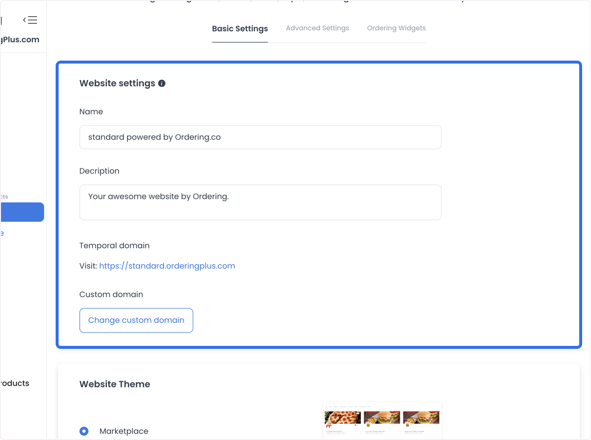
Website information and domain
Use Website Settings to set the website name and description, review the temporary/default domain, and begin a custom-domain request. A custom domain should be entered without http, https, or slashes. See Set up a custom domain for DNS and lifecycle guidance.
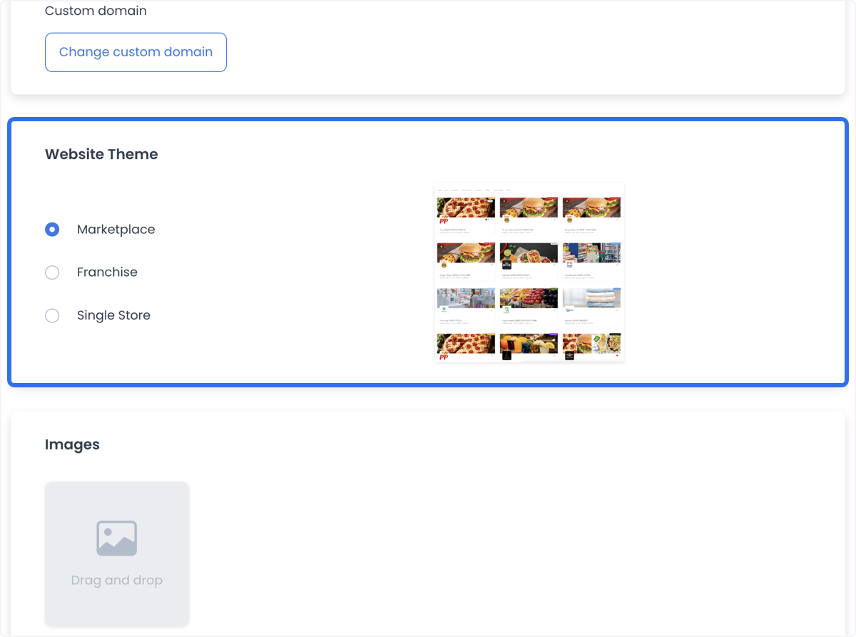
Website theme
Choose the theme that matches the operating model exposed by the editor:
- Marketplace for a multi-vendor marketplace.
- Franchise for a business with multiple locations.
- Single Store for an individual store.
Available themes depend on the selected site. Confirm the visible choices before changing the theme.
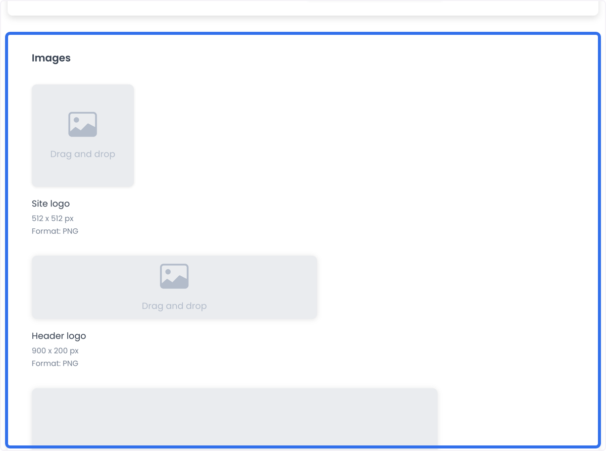
Website images
Use the image controls to provide the visual assets used by the website. The documented recommendations are:
| Asset | Size | Documented format |
|---|---|---|
| Site Logo | 512 × 512 px | PNG |
| Header Logo | 900 × 200 px | PNG |
| Site Image | 1920 × 1280 px | PNG |
| Homepage Background | 1920 × 1280 px | PNG |
| Homepage Mobile Background | 1440 × 770 px | PNG |
The reviewed upload controls also accept JPEG, JPG, and WebP. Follow the editor’s current requirements, use the asset that fits the selected site, and review the visual result on the target form factor.
Theme colors
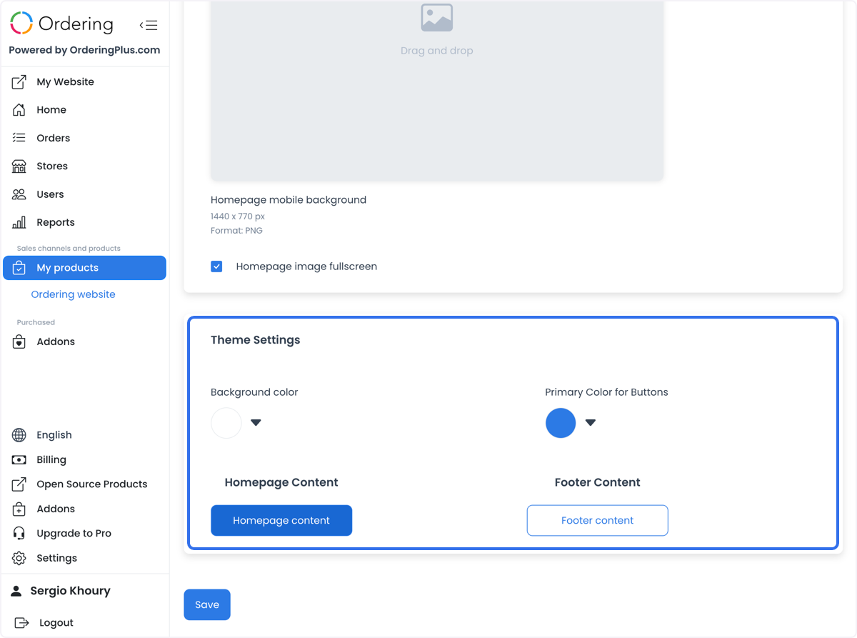
Set the website background color and the primary button color to align with the business identity while maintaining readable contrast.
Homepage and footer content
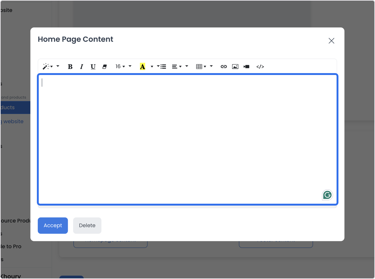
Use Homepage Content to highlight key information and Footer Content for contact information, social links, legal links, or other supporting details. The editor can provide a WYSIWYG interface and supports HTML where shown. Before editing markup, create a backup and make small, reviewable changes.
For the full content and static-page workflow, see Edit website content and static pages.
Basic Settings examples
- A new marketplace can choose the Marketplace theme, add a site logo and header image, and introduce the platform through homepage content.
- A franchise can choose the Franchise theme, use location-aware imagery, set its chosen custom domain, and provide location information in homepage content.
- A single store can choose the Single Store theme, showcase its offering in the site image and homepage background, and use the footer for address, contact, and social links.
- A seasonal campaign can update the homepage background, primary button color, and homepage content while keeping the result readable.
- A rebrand can update logos, background colors, and homepage content together so the customer-facing presentation remains consistent.
Advanced Settings
Advanced Settings group more detailed customization controls. The selected website can expose controls for buttons, typography, placeholder images, header and listing presentation, business and product blocks, cart and checkout, account and order pages, menu options, order-type prompts, and third-party code.
Buttons and typography
Use Buttons to set button color, border radius, button-text color, and any custom sound control offered by the selected site. Use Typography to select a font and a primary font weight from 100 (Thin) through 900 (Black) where those controls are available.
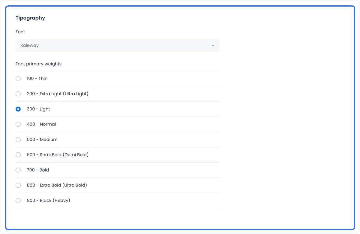
Image placeholders and favicon
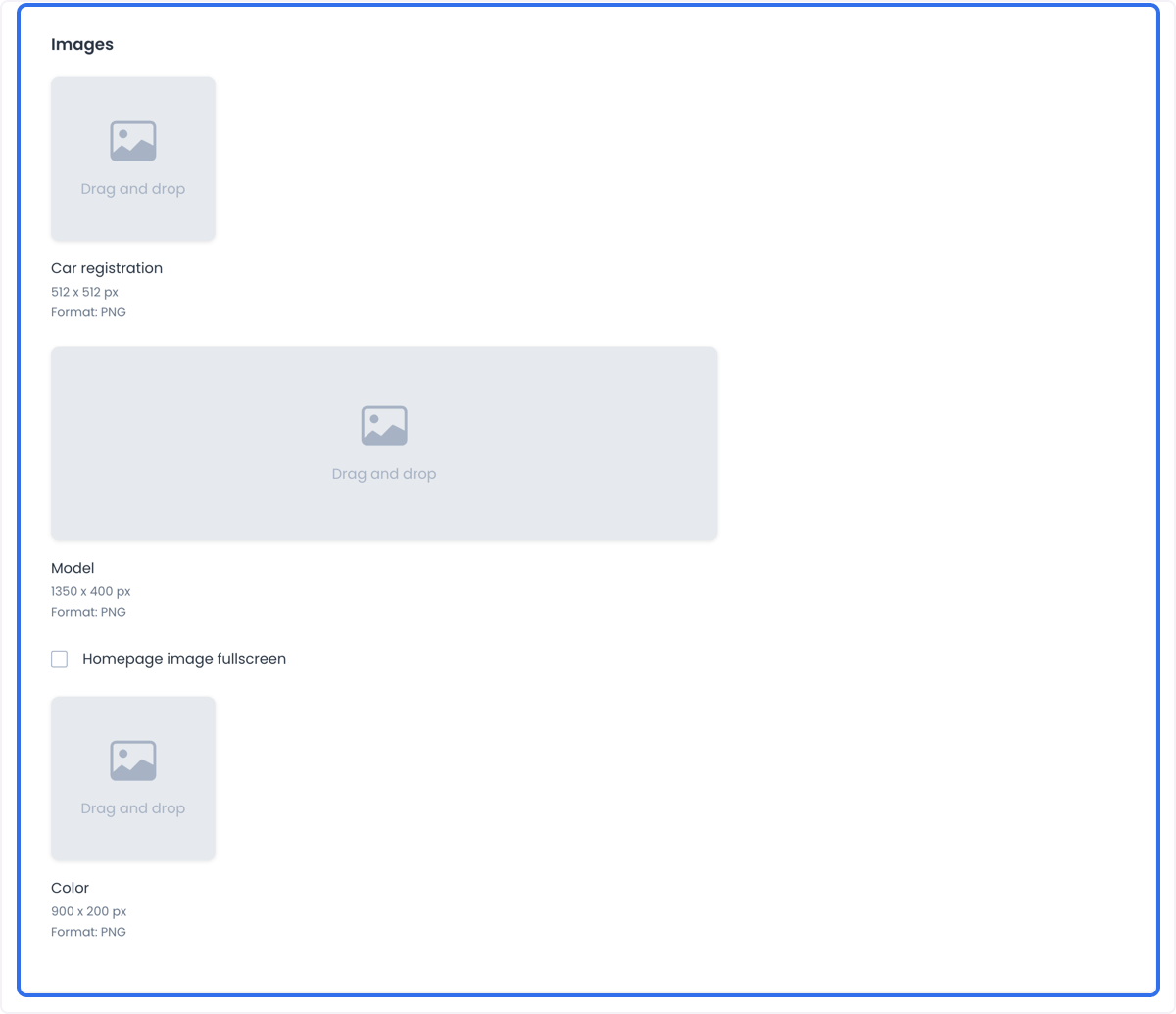
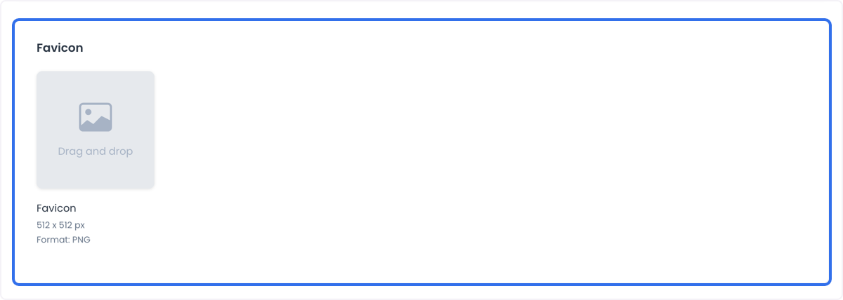
Advanced Settings can specify a 512 × 512 px PNG business-logo placeholder, a 1350 × 400 px PNG business-header placeholder, a 900 × 200 px PNG product placeholder, and a 512 × 512 px favicon.
Header and business listing
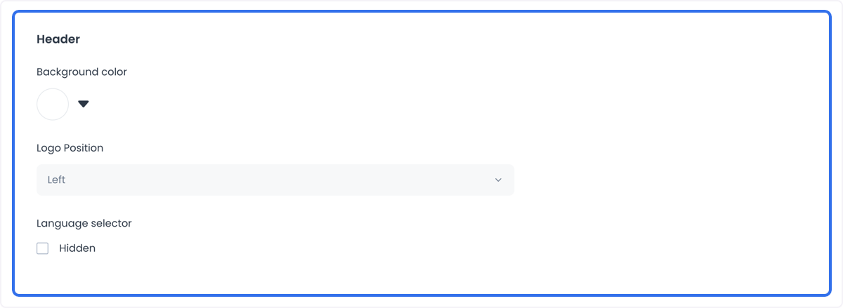
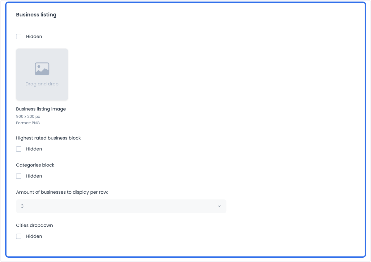
The Header controls can include background color, logo position, and a language-selector visibility switch. The Business Listing controls can include a 900 × 200 px PNG listing image, highest-rated and category blocks, the number of businesses per row, and a cities dropdown.
Business, product, cart, and checkout surfaces
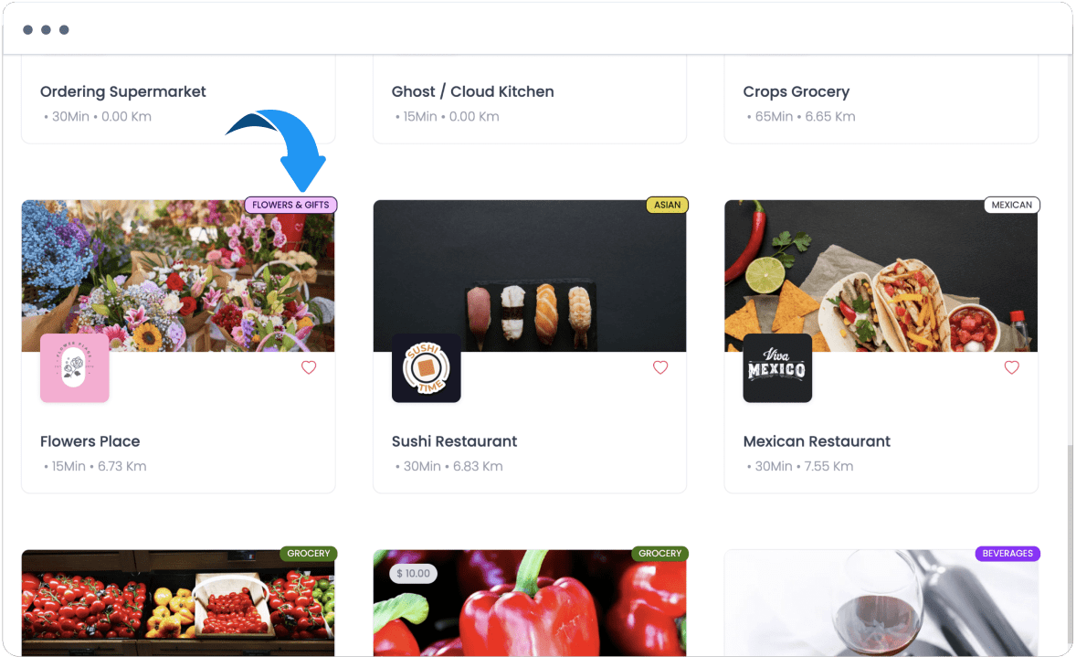
- Business Block: show or hide the logo, header, delivery fee, delivery time, distance, reviews, favorite button, offer badge and its position, and featured badge.
- Business Page: configure default background, previous-orders and nearby-business blocks, reviews and comments, ranking, review dates, search, logo, information icon, header, and review surfaces.
- Business Information: control description, videos, delivery time, pickup time, images, and address visibility.
- Products Block: control a fallback image, description, image, element position, add-to-cart button, favorite action, review popups, and review date.
- Cart Header: control business and product images, discount coupon and comments fields, and the popover or slide opening strategy and position.
- Checkout: control business address, map, address popup, internal-number and address-notes fields, and icons where available.
Account, orders, navigation, and order types
- My Account Page: control user image, birthday, language selector, and address-list visibility.
- My Orders: control active and previous order blocks, business logo and name, order number and date, review, reorder, favorite, order-status, business-tab, and products-tab visibility.
- Menu Options: control browse and search, wallets, promotions, messages, help, security settings, and favorites.
- Popup: Order Types: configure the title, description, and call to action for Delivery, Pickup, Eat In, Curbside, and Drive Thru where the selected site exposes them.
- Third-Party Code: insert code in the document head or body only when the current website configuration and your change-control process allow it.
Advanced Settings examples
- Use colors, typography, and images to keep the customer-facing presentation aligned with the business identity.
- Hide nonessential elements, such as a business logo, product image, or review surface, only after checking the resulting navigation and customer context.
- Use custom sounds or a language selector only where the selected site exposes those controls and the result remains accessible.
- Use previous-order content or personalized visibility controls carefully; a visible setting does not by itself prove a customer-specific behavior is available.
Ribbon background
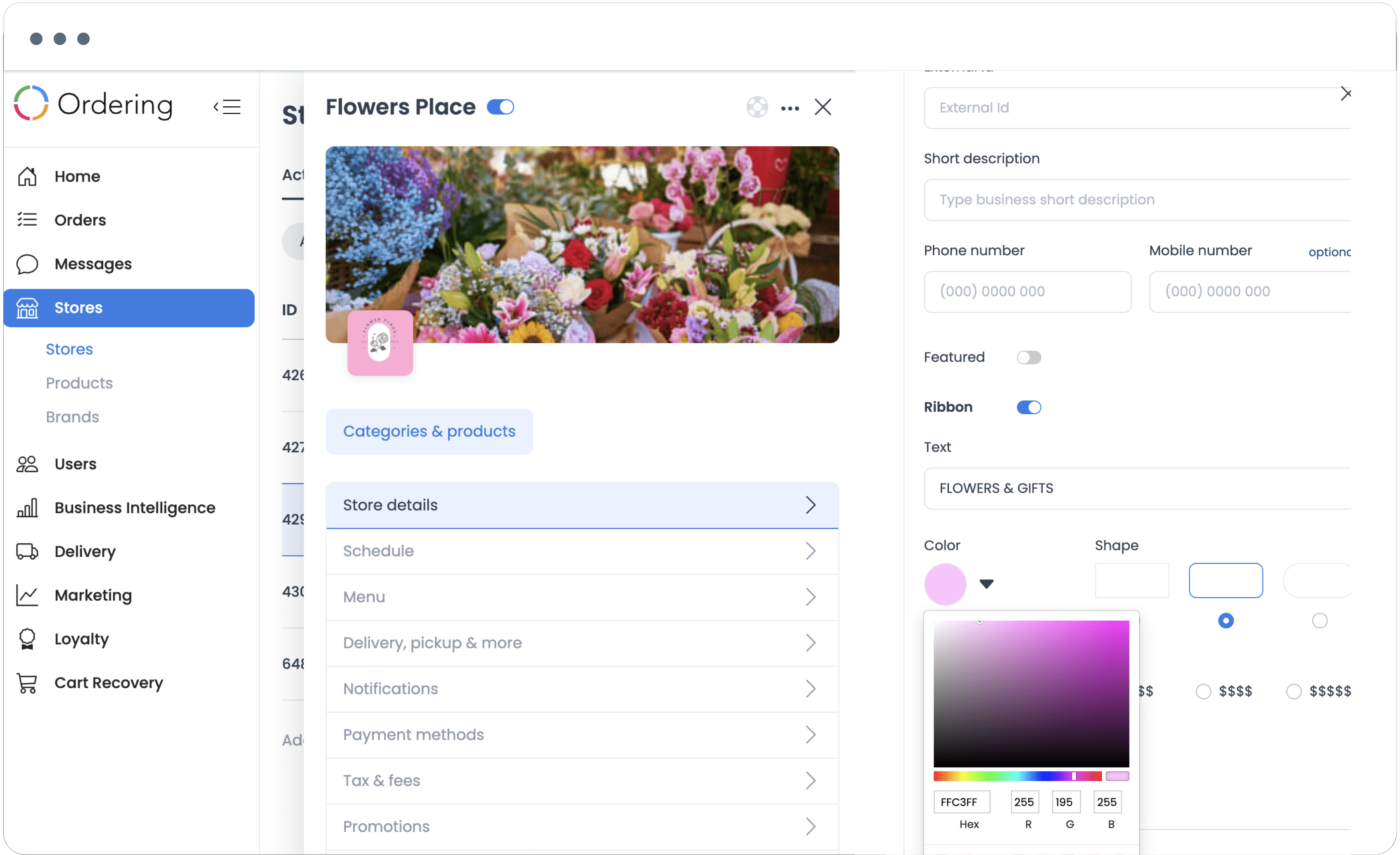
Where the ribbon control is available, choose either white or colors aligned with the store presentation. Review the ribbon’s outline on the customer-facing website after saving.
Review before you save
- Confirm the site, theme, and scope of the setting you intend to change.
- Change only the field or control required for the task.
- Save through the approved workflow.
- Check the result at desktop and mobile sizes, including contrast, navigation, links, and the customer-facing content affected by the change.
Related guides: Manage Ordering Website · Edit website content and static pages · Configure the Ordering Widget