Prepare Marketplace App resources
Back to the Marketplace App guide
Use these resources to prepare a consistent visual experience for Customer App users. Branded images and splash screens can make the first app screen, loading state, empty states, and order-type options easier to recognize across devices.
Before you update an image
Create each image for its specific display purpose and use the documented dimensions and PNG format. App images and splash screens are integrated into the application code. After changing one, rebuild the app and submit the new build to Google Play or the Apple App Store. Customers see the change after they install the updated version.
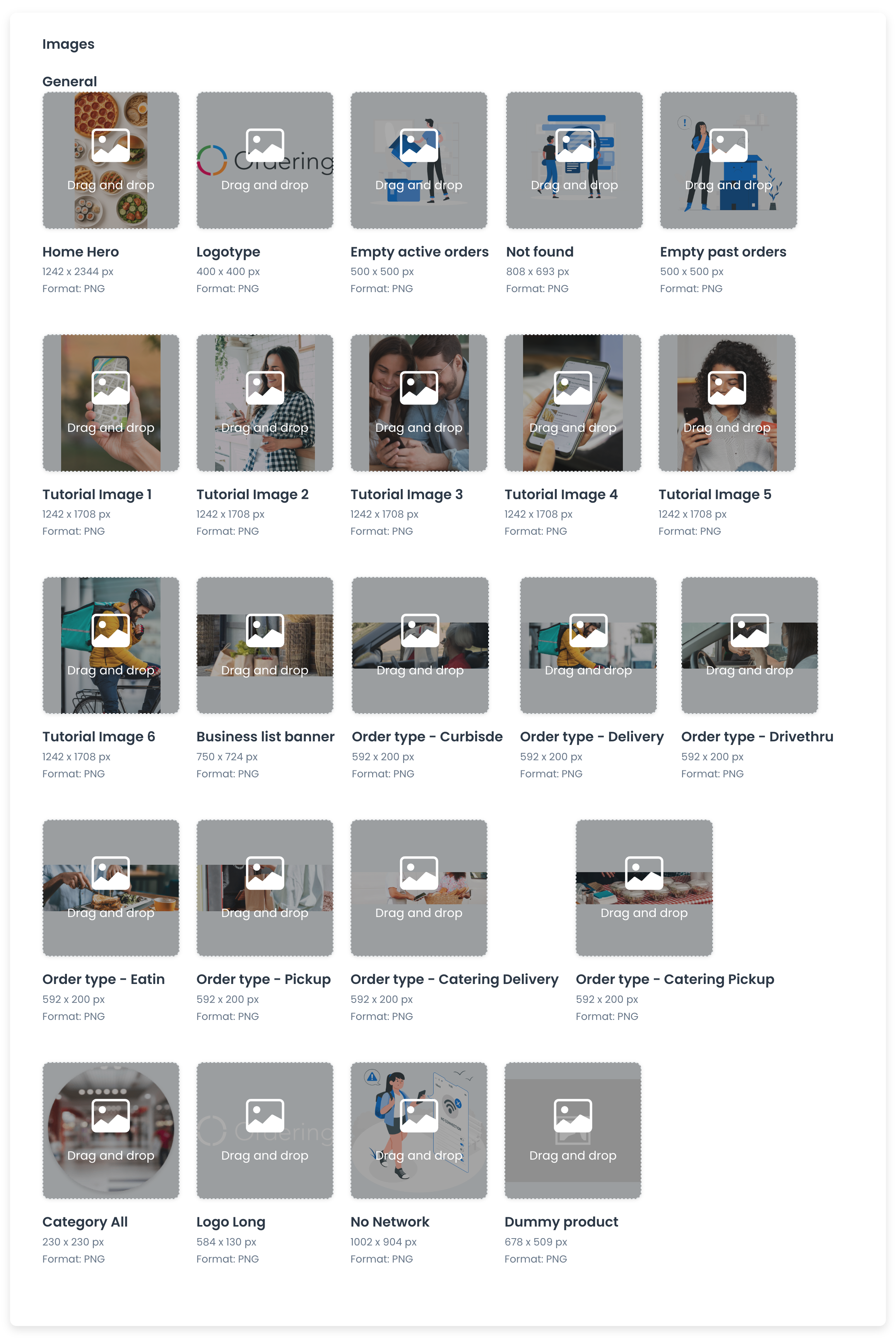
Customer App image specifications
| Asset name | Dimensions | Format |
|---|---|---|
| Home Hero | 1242 × 2344 px | PNG |
| Logotype | 400 × 400 px | PNG |
| Empty active orders | 500 × 500 px | PNG |
| Not found | 808 × 693 px | PNG |
| Empty past orders | 500 × 500 px | PNG |
| Tutorial Images (1 to 6) | 1242 × 1708 px | PNG |
| Business list banner | 750 × 724 px | PNG |
| Order type – Curbside | 592 × 200 px | PNG |
| Order type – Delivery | 592 × 200 px | PNG |
| Order type – Drivethru | 592 × 200 px | PNG |
| Order type – Eatin | 592 × 200 px | PNG |
| Order type – Pickup | 592 × 200 px | PNG |
| Order type – Catering Delivery | 592 × 200 px | PNG |
| Order type – Catering Pickup | 592 × 200 px | PNG |
| Category All | 230 × 230 px | PNG |
| Logo Long | 584 × 130 px | PNG |
| No Network | 1002 × 904 px | PNG |
| Dummy product | 678 × 509 px | PNG |
Splash screens
A splash image, or splash screen, is the first visual element customers see while the mobile app loads. It can reinforce the app’s visual identity, provide a clear loading cue, and make the transition into the app feel consistent. Keep the image focused: include the app logo and other key visual elements, avoid dense text or complex graphics, and use colors, fonts, and graphic styles that match the rest of the app.
Design splash screens at the required resolution for the device and orientation. PNG is the documented format because it supports high-quality images and transparency. Test the images on multiple devices before release so they remain clear in portrait and landscape orientations.
Android splash screens
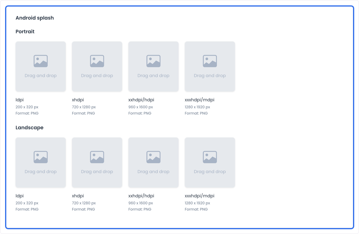
The documented Android image and table show the same dimensions for portrait and landscape. Another related build-resource image presents landscape dimensions in the reverse orientation. Keep the documented values below until the app configuration confirms the required slot; do not transpose dimensions from another guide.
| Orientation | Density | Dimensions | Format |
|---|---|---|---|
| Portrait | ldpi (Low DPI) | 200 × 320 px | PNG |
| Portrait | xhdpi (Extra High DPI) | 720 × 1280 px | PNG |
| Portrait | xxhdpi/hdpi (Extra Extra High DPI/High DPI) | 960 × 1600 px | PNG |
| Portrait | xxxhdpi/mdpi (Extra Extra Extra High DPI/Medium DPI) | 1280 × 1920 px | PNG |
| Landscape | ldpi (Low DPI) | 200 × 320 px | PNG |
| Landscape | xhdpi (Extra High DPI) | 720 × 1280 px | PNG |
| Landscape | xxhdpi/hdpi (Extra Extra High DPI/High DPI) | 960 × 1600 px | PNG |
| Landscape | xxxhdpi/mdpi (Extra Extra Extra High DPI/Medium DPI) | 1280 × 1920 px | PNG |
iOS splash screens
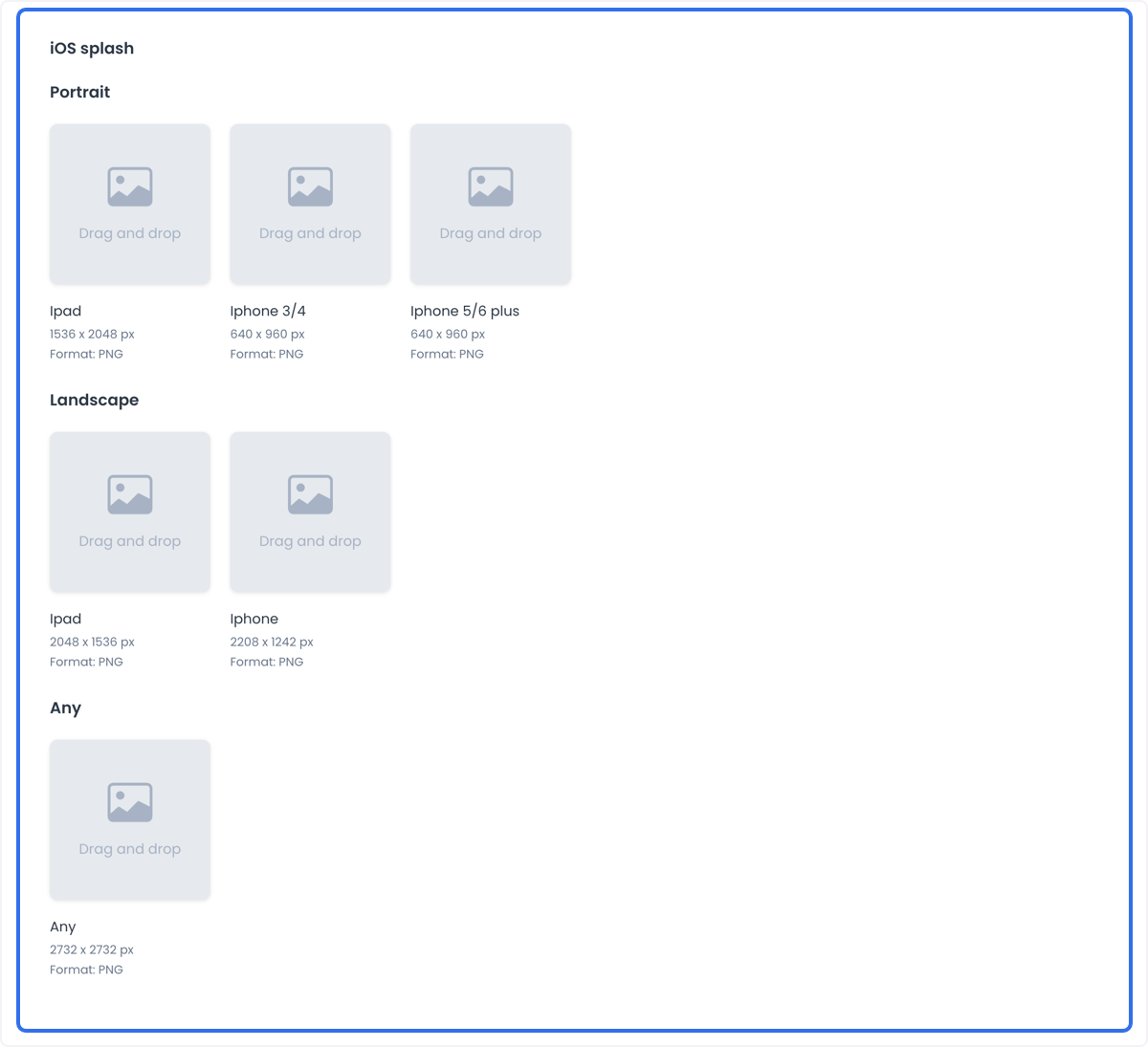
| Orientation | Device | Dimensions | Format |
|---|---|---|---|
| Portrait | iPad | 1536 × 2048 px | PNG |
| Portrait | iPhone 3/4 | 640 × 960 px | PNG |
| Portrait | iPhone 5/6 Plus | 640 × 960 px | PNG |
| Landscape | iPad | 2048 × 1536 px | PNG |
| Landscape | iPhone | 2208 × 1242 px | PNG |
| Any | Any Device | 2732 × 2732 px | PNG |
Why splash images matter
- Brand recognition: A splash image can include the app logo and branding elements so the app is easier to recognize.
- First impressions: The launch screen can set a clear, professional tone at the first point of contact.
- Aesthetic appeal: A visual transition while the app loads can maintain interest and engagement.
- User experience: A loading cue can set expectations and reduce the perceived wait time.
- Consistency: Matching the rest of the app’s design helps create a unified experience.
Plan, build, and test
Prepare every required size and orientation before integration. Test the screens across the devices you support, then rebuild the app so the assets are included in the application code. Upload the resulting version to the relevant app store for customers to receive the new images.
Use cases
The same workflow can support a food delivery marketplace that wants a recognizable launch screen, a fashion retailer that refreshes seasonal imagery, or a multi-service app that uses distinct visual treatment for each service. In each case, the image still needs to match the assigned slot, format, dimensions, and release process above.
Consistent, correctly sized resources help create a recognizable and professional app experience across supported devices.